This blog post is intended for research and academic staff interested in developing basic graphic design skills to improve the visual appearance of their documents. The material discussed is a summary of graphic designer Robin Williams’ (not the actor!), The Non-Designer’s Design Book. This book is written for people who are new to design and have no academic training in the field. The author offers many powerful examples, in a language that is always accessible. If you are a novice and looking for a book, this is the one for you!
C.R.A.P !
The book is centered around 4 key design principles: contrast, repetition, alignment and proximity. Understanding these principles will help you better understand the world around you (you won’t read your magazines in the same way) and better communicate your messages. Yes, form is as important as content.
Create contrast to avoid boredom
Contrast is defined as the opposition of two things, one of which makes the other stand out. Avoiding elements that are too similar or identical (colors, size, shapes, etc.) is essential to avoid boredom. Instead, they should be differentiated to attract attention and clarify the message.
In the visual on the left below, the font of the title and the content are similar and their color is identical. The colors of the lines are in orange tones. Boring, right? In the visual on the right, the title and the text use different font families and the formatting of the title is contrasted (white on colored background vs. black text). The lines are of the same color but the last one, thicker, echoes the layout of the title rectangle.
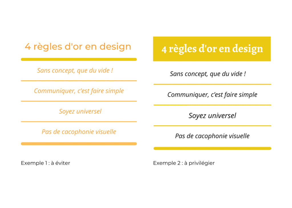
Common mistakes in terms of contrast: 1) using two colors close to each other on the color wheel (e.g. brown with black); 2) contrasting a thick line with an even thicker line; 3) using two fonts from the same family.
Repetition enhances organization
A visual is usually composed of several categories of information: text, tables, photos, elements (icons, lines), etc. Repeating some of this information helps organizing and reinforcing the unity of the document.
The example on the left illustrates the principle of repetition. The same font (Abril Fatface) is used for the page headings while a second font (Montserrat) is used for the body text. The colors of the logo are repeated throughout the document: blue, black and white are used for the font, while magenta, green and blue are used for the elements.
The image was chosen because the elements that make it up (magnifying glass, notebook, keyboard) have an important symbolism. The color simplicity of the image contrasts with the more colorful look of the document. The magnifying glass in the image echoes the one in the logo.
This way, repetition is applied in multiple ways on the page. We naturally expect that the other pages of the document will also repeat these stylistic elements
We naturally expect that the other pages of the document will also repeat these stylistic elements
Nothing should be placed arbitrarily. Elements must be connected to each other in some way to create a clean and sophisticated result. To understand alignment, nothing better than drawing horizontal and vertical lines from the ends of the elements on a page to see which ones are aligned and which ones are not. For writing, alignment can be right, left, justified, or centered. The latter is generally not recommended. The most common mistake in aligning text is to center the title and justify the rest.
Robin Williams recommends having a strong line and sticking to it throughout the document.
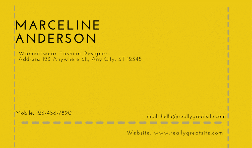
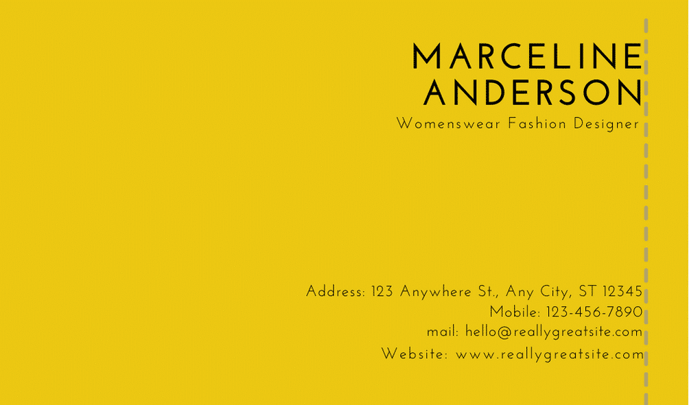
Below, on the business card on the left, the lines drawn shows the lack of alignment (there are as many alignments as there are blocks of text). On the business card on the right, you can see that there is an alignment on the right (you wouldn’t have to draw it to guess it, it’s what the author calls having a strong line).
Proximity of similar elements
Elements that go well together should be brought together in the same area. Conversely, there should be space between elements that are not related to each other. This helps to organize and structure the information, which makes it easier to remember.
It is important, however, to avoid too many clusters, as the eye will quickly tire of the same-sized empty spaces between each area. If we take the example of the business card, we can see that the elements on the left are very scattered while on the right they are grouped into two blocks. Which business card is easier to read? The one on the right!
A word about colors

The choice of colors plays an important role in the creation of visuals. Sometimes we can start with a color palette that constitutes the visual identity of the entity (e.g. a research center). Other times, we have to start from scratch. A color wheel is roughly composed of 12 colors, some cold (derived from blue) and others warm (derived from red or yellow). The cold colors give the illusion of being far away, in the background, while the warm colors give the illusion of being in front, in the foreground.
Colors are said to be complementary when they are opposite each other on the color wheel (e.g., blue and orange, or purple and yellow) while triads refer to the 3 colors taking the form of a triangle on the color wheel (e.g., red, yellow and blue). Two main models can help to choose a color palette, depending on the use that will be made of the visual. The CMYK (Cyan, Magenta, Yellow and Keycolor – usually Black) model is best for visuals that will be printed, while the RGB (Red, Green, Blue) model is best for visuals that will appear exclusively online.
Robin Williams’ book explains these models and allows you to go even further in understanding colors with shades, tints and shadows. A great color wheel, free and complete, has been created by Adobe.
Font styles
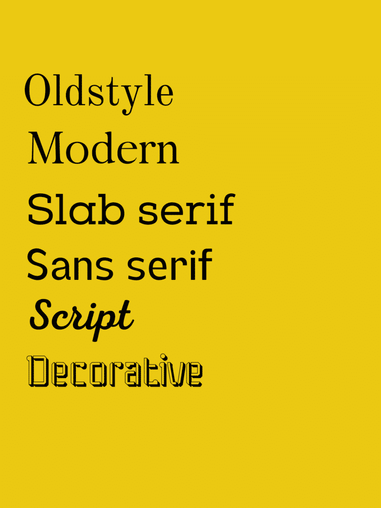
There are many different font styles, which can be grouped into 6 major families according to Robin Williams: Oldstyle, Modern, Slab Serif, Sans Serif, Script, Decorative. Note – however, this classification of fonts varies depending on the software used (Adobe, Microsoft, Canva, Designrr, etc.).
When you want to use two fonts in the same document (it is preferable not to exceed this number), for example for titles and paragraphs, it is essential to choose fonts from different families, to respect the principle of contrast.
There are websites where you can find and download fonts, such as
Google Font or 1001 freefonts. Other sites allow you to test and choose font combinations. For example, on Fontpair, the text examples are visually appealing and allow you to visulaize quickly, with font combinations for titles and paragraphs.
Some general advice
- Train your eye. We are surrounded by visuals (in newspapers, on packaging, on the internet, etc.).
- Becoming aware of what you like based on the key concepts will help you make them your own.
- Make your visuals as light as possible by leaving space between elements and between letters.
- Don’t be afraid to play with the size of the font: very large or very small, depending on the message.
- Always have one element that stands out, so as to attract the reader’s attention. Use strong subheadings (in terms of aesthetics and meaning, to make it easier to read).
- Once you’ve learned the basic techniques, you can break the rules. One thing at a time.