
Finding a name is the starting point of a business. The objective is that the name 1) has a strong symbolism, 2) gives an idea of future activities and 3) is a pleasant and memorable-sounding. The method used for this exercise: brainstorming, "letting it rest", researching competitors and definitions on the web.
In concrete terms, we listed all the ideas that came to mind, without passing judgment (judgment being the enemy of brainstorming!). We spent hours on Google checking or discarding options and reading definitions. The last idea of a long weekend of reflection was the right one: PhDesign.
"Ph for the symbol of balance at the heart of life and of our communication activities, Design for its definition as modern and functional aesthetics, PhD because we are scientists by training and our services aim to serve the research community." (Jane, agency founder)
Positioning expresses how we want PhDesign to be perceived by the community we serve. The mission, on the other hand, is the goal PhDesign seeks to achieve. Finally, values are fundamental principles that guide activities, communication actions and work philosophy. These exercises are more difficult than they seem because there is so much to say! The method used for these simultaneous exercises: brainstorming, "letting it rest", analysis of writings on the subject, intervention of an outside expert to validate understanding.
So, after several brainstormingsessions, we defined our positioning as: bringing research and society together. It will take several years before we are perceived as such, we obviously have to prove ourselves. So why think about positioning right now? Because it sets the guidelines for the next steps.
Defining PhDesign's mission was one of the longest steps. Several iterations with long and sometimes complex sentences were necessary. The "let it rest" technique and the intervention of an outside expert were particularly successful in providing the necessary distance. The PhDesign mission has been defined as follows: to better communicate research in order to make it more visible, more understandable and therefore more beneficial to society.
Finally, the selection of values was one of the easiest steps. From an extensive list of possibilities, we selected those that resonated most with us: passion for bringing research and society together, simplicity in our processes and relationships, creativity in carrying out our projects, humility in recognizing the plurality of knowledge.
We will go through the Positioning, Mission and Values exercise again on a regular basis, as these elements will change over time. This first exercise naturally led us to the second: the visual identity.
The visual identity is the graphic identity card that allows people to recognize an entity. Logo, colors, font, pictograms, type of photos, in short, all visual elements! The chosen method: several meetings with our graphic designer, who became familiar with our raison d'être.
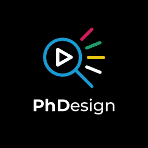
Regarding the symbolism of our logo, the magnifying glass represents research, the triangle represents the Play symbol (for videos, podcasts, but also action), the lines on the right represent the resonance generated by our activities, but also by the work of the research community. Some people may also see an eye looking to the right, symbolizing the future.
The colors are a mixture of cold colors (green and blue), symbolizing calm and serenity, and warm colors (yellow and pink) symbolizing emotions, vivacity and energy. Finding balance was at the heart of the reflection, even in our color scheme!
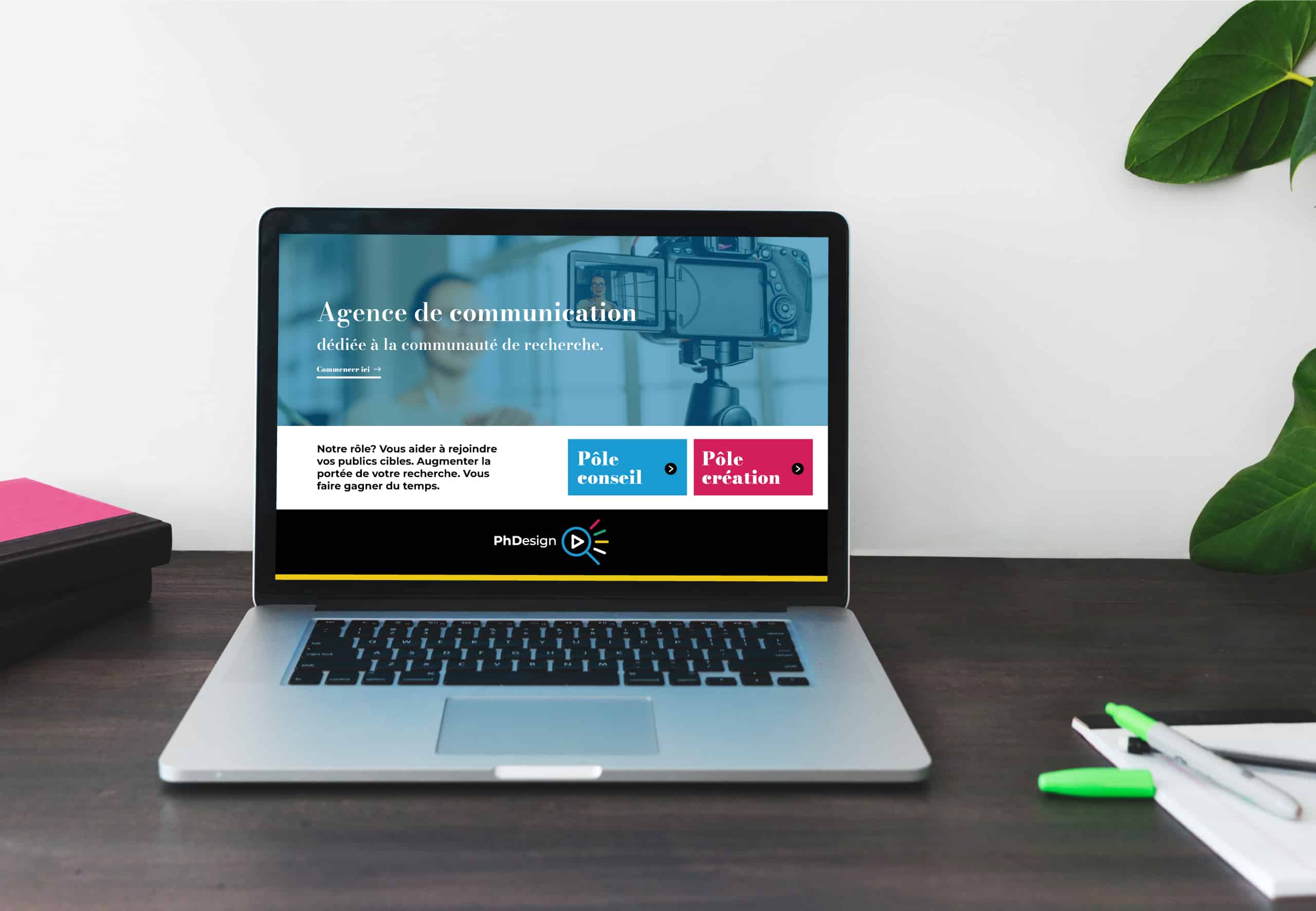
A website is a business card and a platform to inform and interact with your community. Form (e.g., font size, choice of visuals) is as important as substance (e.g., choice of words and topics presented). The method used for the site: definition of a hierarchy, writing of texts, revision for SEO optimization, creation on Wordpress by a developer.
We wanted simple visuals and content. The search engine optimization strategy - or SEO strategy - was not easy because we are in a " niche " type of domain. Indeed, few people browse the web for " communication services for research " or " scientific communication services ". After several months of iteration, we got to the site you are now discovering!